Senior UX & UI Designer - Elder Scrolls Online

My Ownership
My responsibilities on Elder Scrolls Online boil down to a fairly simple directive: make the game easy to use and engaging for players, while preserving the UI and existing flows that made the game great to begin with.
Within that framework, I tend to follow the double diamond method wherever possible. Soon after being onboarded to a new feature by stakeholders, I will collect as much internal data as possible. Additionally, I’ll scour our forums and other social media for any player sentiment that could be relevant. From this data I begin building player profiles to refine who this feature is going to appeal to and how each groups’ needs will differ. Once those targets have been identified, I’ll begin my mockup and validation process, progressing from low fidelity brainstorms to high fidelity, validated mockups. Throughout the validation process, internal playtests are held when possible, and engineering, stakeholders, and QA are consulted regularly to ensure alignment as the feature evolves to its final, shippable form. During the Public Test Server cycles, I watch out for player sentiment and feedback, and triage issues as they occur.
Typically, as a feature launches, my direct involvement ends until bugs are discovered that warrant redesigns of some kind.
Case Study 1: Group Finder
Problem Space
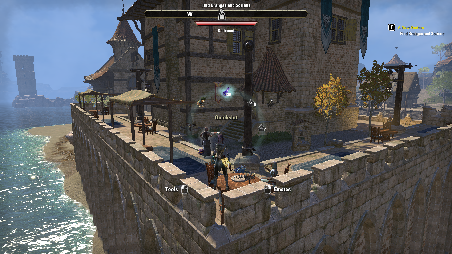
Group Finder at its core was the desire to unify all of our various matchmaking processes. Our large slices of group content were scattered in various menus and flows, or did not have a matchmaking flow to begin with-such as our largest PvE group experience: Trials. Clearing up this confusion was the biggest problem to solve, with creating a cohesive player experience within the feature itself a close second.
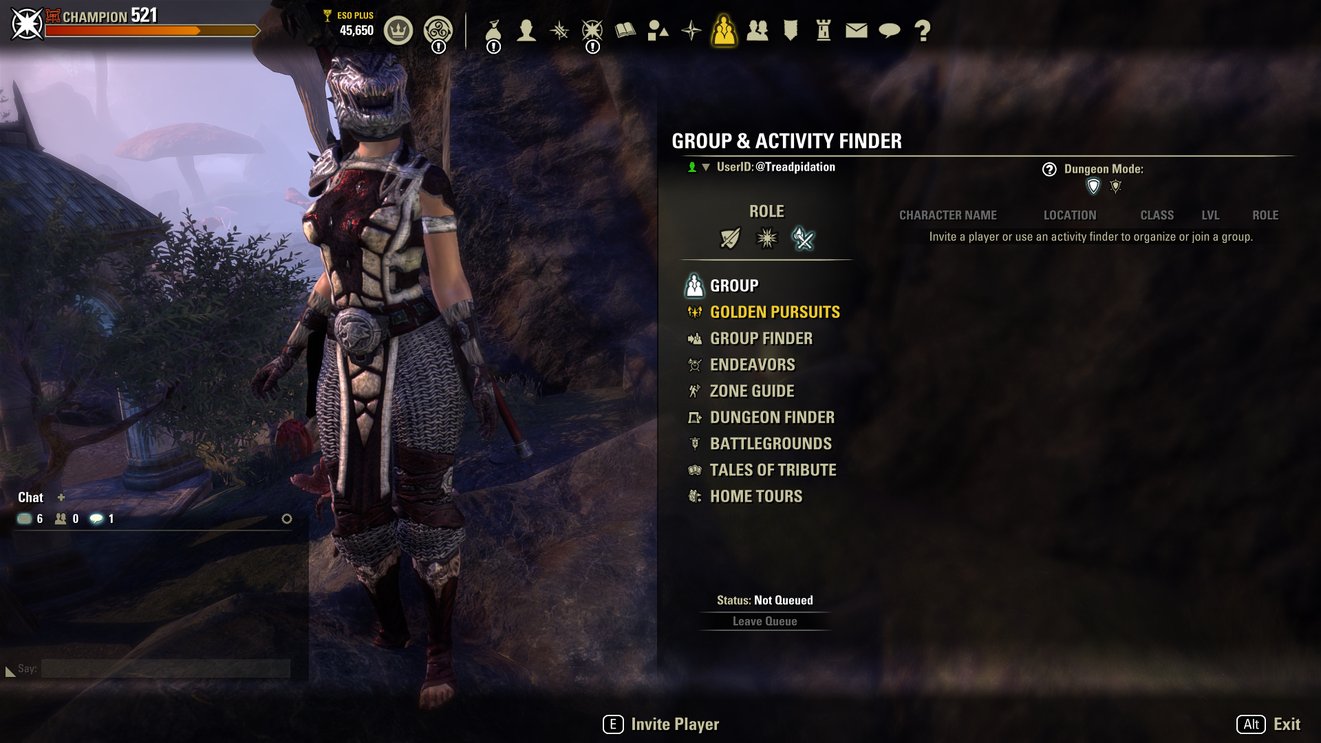
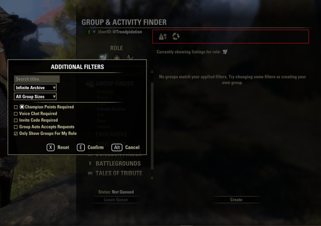
Even when only considering the existing matchmaking flows (Of which 3 are shown here), the player experience to find a competent group to play with was limited and confusing.
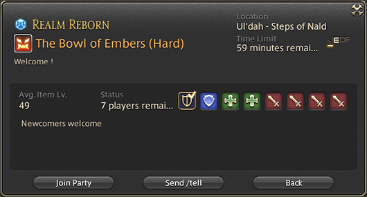
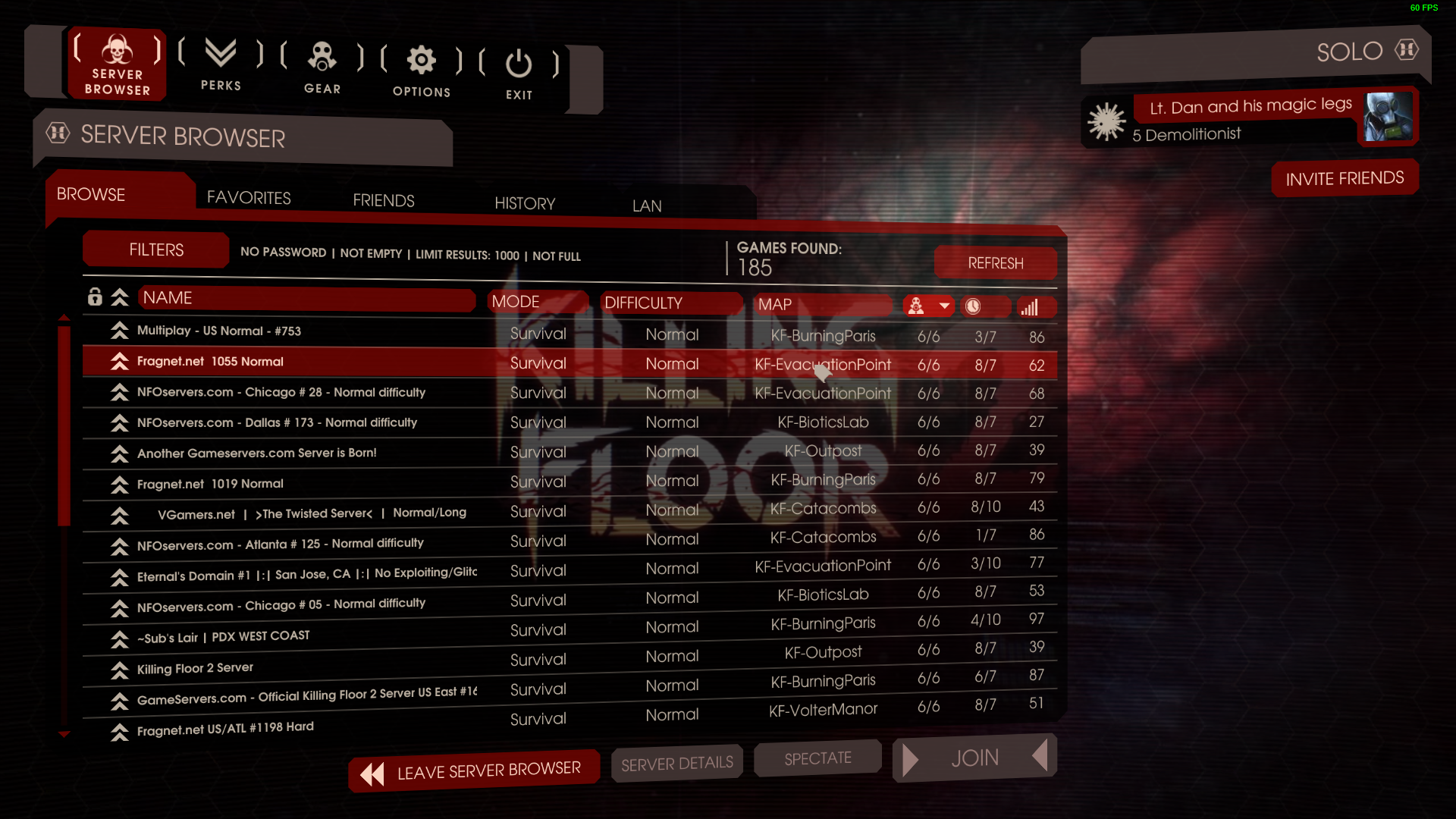
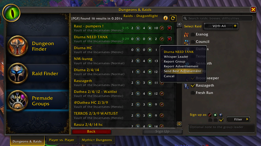
Final Fantasy 14, Killing Floor 2, and World of Warcraft were just a few experiences I used for comparison when designing the ESO group finder.
Research and Player Profiles
My work on this feature started with a few basic questions: Who were the players that were most likely to use this feature? What needs did they have that this feature must sufficiently cover? Which basic features that our players are likely to use in our competitors’ games are baseline expected here?
While I cannot share specific data, my research led me to believe that the largest user of a group finding feature would be the PvE community, specifically those that run our Dungeon content. To that end, I knew the primary profile I would need to develop for: Someone focused on our 4 person PvE gameplay, that will want to scrutinize and maximize individual role performance for efficient Dungeon runs. Within this profile, there are of course a few sub-profiles: Not everyone running this type of content wants to maximize efficiency. Some want to learn the dungeons well, and others are more focused on the excellent narrative that ESO provides. All of these profiles needed to be accounted for.
I continued building out player profiles and sub-profiles like the one outlined above based on available data until I felt that I had sufficiently captured all of the various cases we could reasonably implement into the feature. These profiles along with competitive analyses helped me begin synthesizing my first few mockups that could then be challenged against stakeholder expectations.
Solutions
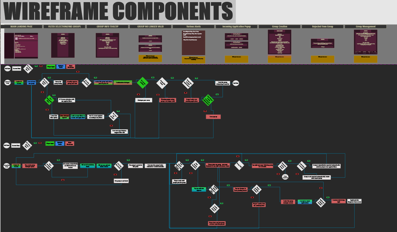
The planning for this feature involved extensive wireframing and flowcharting to make sure the initial vertical slice met all stakeholder expectations. Early on I created component libraries to speed up iteration time and avoid backtracking while I blocked out the initial categories I identified in my research:
Dungeons
Trials
Arenas
PvP
Questing / Zone
Custom
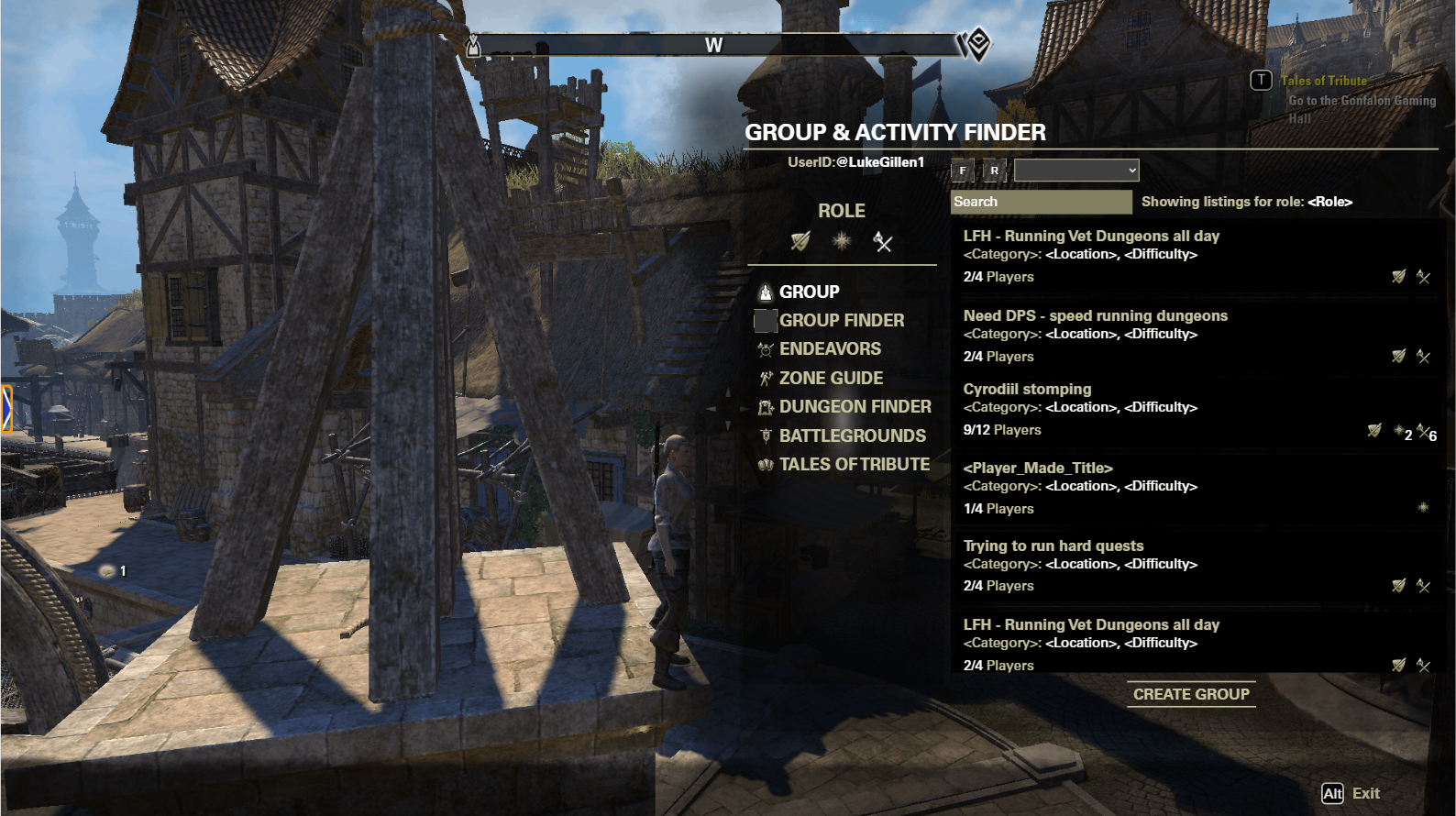
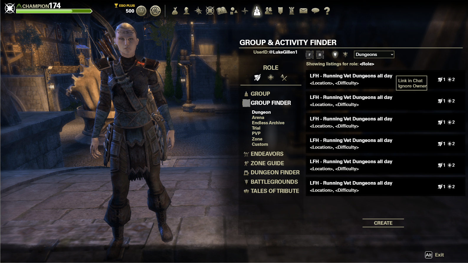
To keep all of these categories similar in feel while addressing their individual needs, I added the more category specific information further to the right in the header area in dropdown boxes. We then structured all of our primary and secondary data for each category in such a way that it would fit the dropdown paradigm.
The last two images on the left showcase the many adjustments the design went through. Much of the initial typography and layout was changed due to technical limitations, as well as feedback gathered internally from our numerous qualitative-focused playtests. Throughout the implementation process, engineers that were using the flows constantly throughout their work gave valuable feedback that further helped me move towards our final, shippable product.
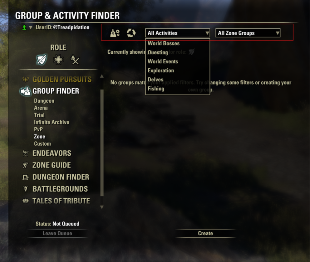
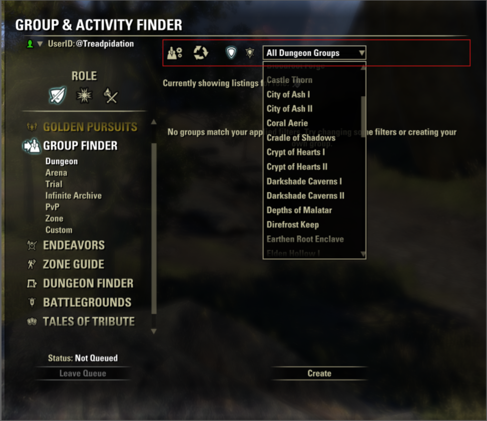
As the player navigates categories, the header footprint mostly stays the same, and only changes to include necessary information and controls.
These two mockups shows the numerous small tweaks from my initial concept to the final, validated mockups.
Impact and Learnings
The Group Finder feature has successfully become an evergreen system that facilitates groups created with Player generated criteria.
~1.8m+ successfully created groups, lifetime
~10k+ average distinct player interactions, daily
~1.7k successfully created groups, daily
Anecdotally, I see mentions of the group finder in chat almost every time I play the game to help form groups for our more complicated content.
The numbers reveal some interesting facts:
12 person trial groups are the predominant group type used by the system
Many people search for groups, but few create groups.
The first bullet point suggests that my initial research was skewed by the raw number of players that engage with dungeons over trials, likely due to its innate accessibility through existing matchmaking systems.
The effect of that second bullet point often results in an empty looking system, but the data reveals that groups fill on average less than 2 minutes after being posted, and therefore a backlog of groups is not achieved. (Which is better than the alternative).


The screens shown here are fully implemented into the game after numerous player feedback cycles on our test server.
Case Study 2: Returning Player Guide
Problem Space
The Returning Player Guide was an effort to attack one of our core retention issues. Looking at our data, we knew we had a common cyclical pattern: Players that were once highly engaged with the game would come back for a few days every few months and then drop off again fairly quickly. How do we get those players, as well as those returning after a much longer hiatus to stick around and play even just one more day? On a much larger scale, how do we surface the hundreds of hours of content ESO has to offer in a way that is palatable to the average, non-hardcore player that would get them to engage with our “stickier“ systems?
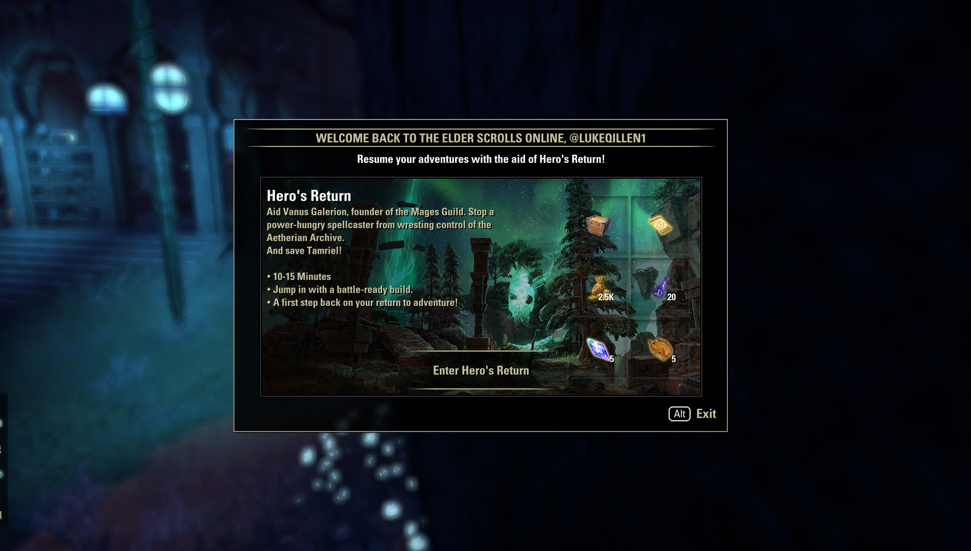
This panel is the first look a player gets of the Returning Player Guide
This screen is the common point between the two player profiles in Golden Pursuits. From here, the activities branch out according to which bucket the player fits into.
Research and Player Profiles
Early on, the team identified our 2 core player profiles:
Players with old characters that have not logged in for 6+ months
Players with new characters that fell off during / shortly after the tutorial
These two groups accounted for ~80% of our lapsed players. Our theory early on was that it would be better to concentrate our efforts on curating experiences for these two groups, rather than provide a single experience that could apply equally unsatisfactorily to all possible player profiles.
From here, we next identified our content that we defined as “Sticky“ - systems and quests that players would typically remain engaged with as shown in data. While I cannot discuss the details, once these systems were identified, my task was to then help provide vectors to those systems.
Solutions
The initial mockup explorations differed greatly from the final, shipped feature. As myself and the team explored more options. A non-exhaustive list of prototypes that were rejected:
Bulletin style popup showcasing new features from when the player last played
“Returning Player Hub“
Build guide / helper
Champion point guide / helper
Fundamentally, these solutions were desired by players (qualitatively found through player surveys and forum feedback), but would not solve the core issue of getting the player to log in one more day due to the disconnect that occurs when the player logs in initially. As with every feature, our blue-sky exploration time had limits so that we could actually ship something for our deadline, so we decided our best solution was dual-pronged:
Get players immediately in the action with a preset build to help rediscover the Fun of the game
Provide players with structure via short-medium term goals to remove any friction in finding and engaging with sticky features
The first bullet point was accomplished via a “Welcome Back“ panel that would display as soon as the player logged in, for maximum visibility and engagement. This decision was backed up by data provided by another Microsoft owned Game Studio that showed extremely positive retention results after employing this strategy.
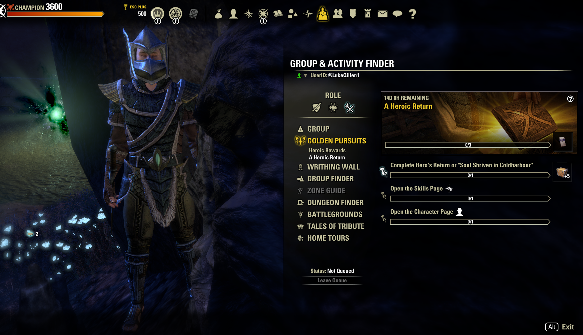
The second bullet point was facilitated with tweaks to an existing system: Golden Pursuits. While the core experience was kept the same, returning players were shown a new screen that would showcase all of the possible rewards they could earn throughout the Returning Player Guide. I did not want to overwhelm players with a giant roadmap they would have to engage with, but showing off the rewards they could earn through their play time was critical to this strategy succeeding. The golden pursuit is split into two pathways, with objectives appropriate for each of the two core player profiles identified above.
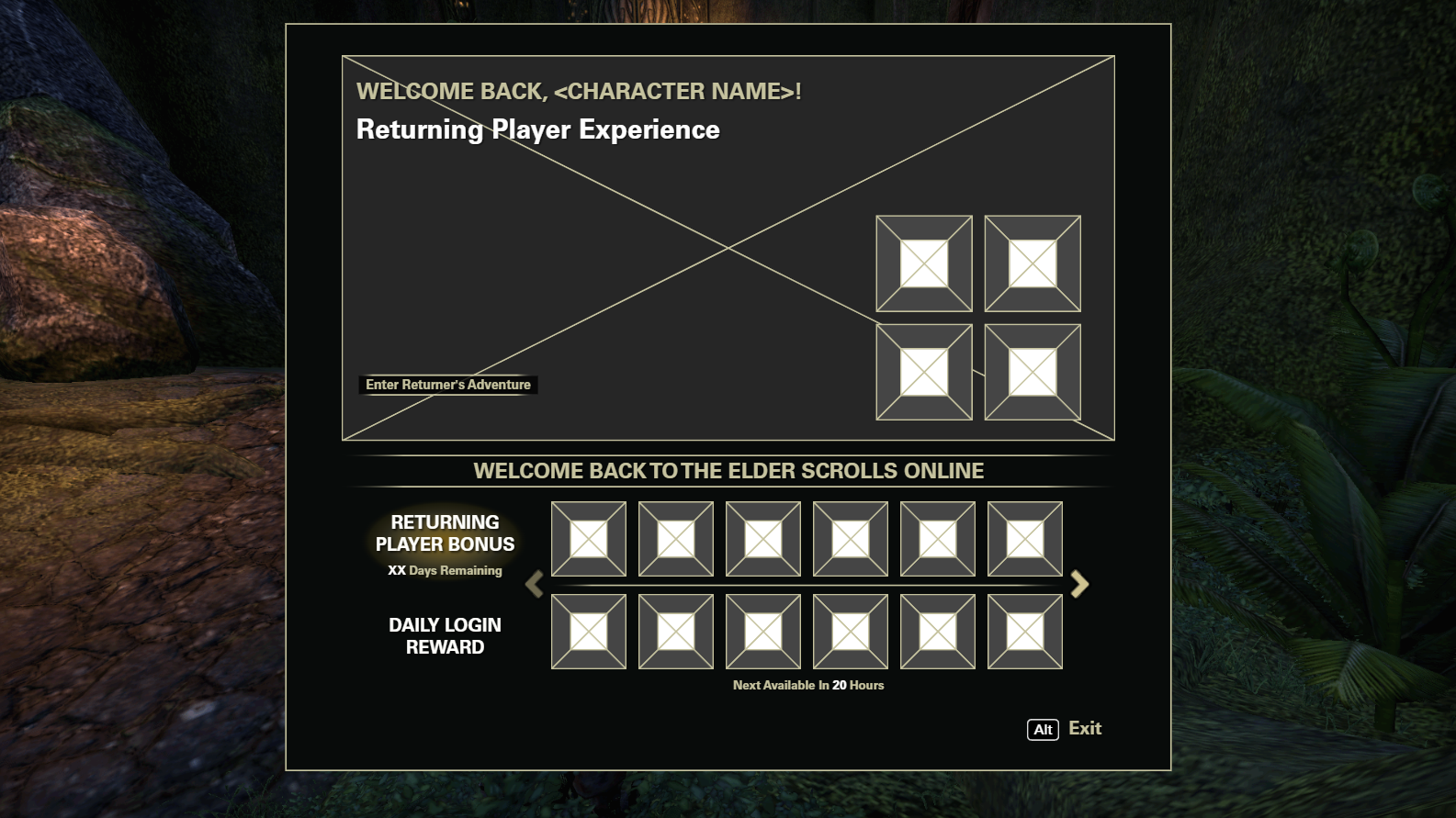
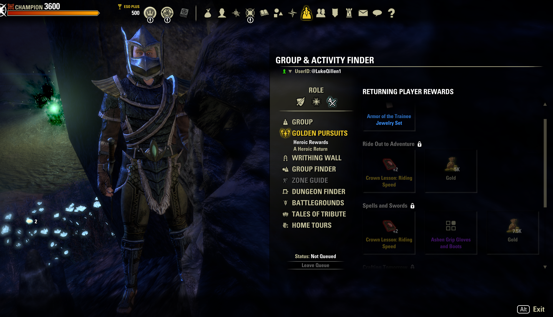
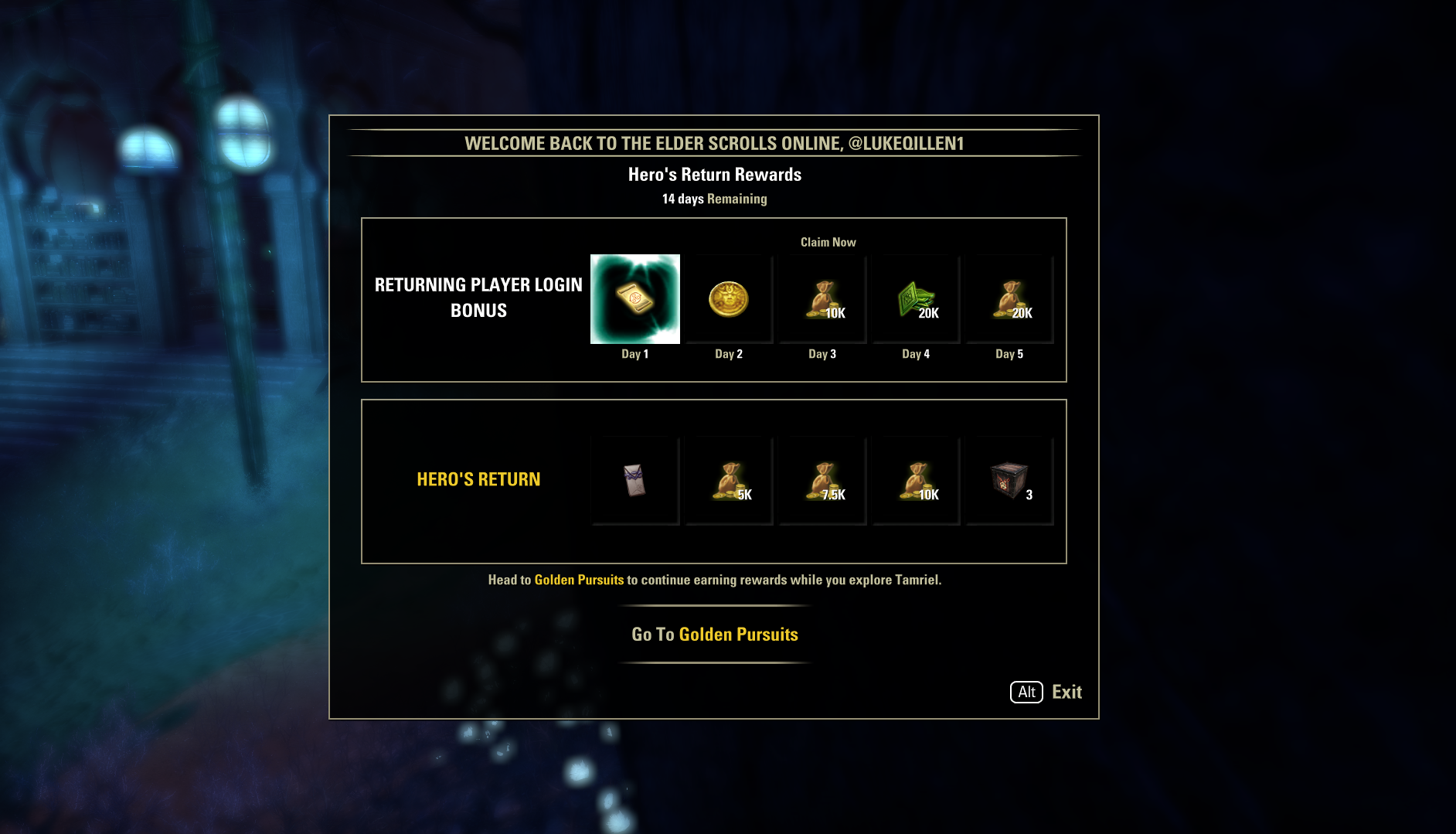
These screenshots show some of the iterations the initial panel shown to players went through. Ultimately, the panels for the returning player experience and the rewards for said players were split up to reduce confusion and friction to enter the system.


These screens form the Returning Player Guide funnel, designed to reduce friction for returning players to just jump in and get playing.
Impact and Learnings
The Returning Player Guide feature was always meant to provide a bump in player retention, and in general retain players that would otherwise churn out of the game, not fix every core retention problem.
Given the nature of this feature, I cannot provide confidential, specific data. I can at least break down some of the criteria we used to determine success at the beginning of this feature:
Did absolute retention show significant increases after the launch of this feature? Yes.
Does this feature beat classic retention in terms of % of players retained after X days? Yes.
Once again, in addition to the Group Finder feature discussed above, this feature is an evergreen system that will be constantly working in the background to retain players more effectively than just the standard returning player experience. Anecdotally, it does not address much of the qualitative feedback and data we gathered from players, which could be an improvement made to the system given additional resources. Admittedly, much of the feedback we received from players via forums addressed the rewards offered from the experience and the effort required to get them, and did not include additional features that could be added.
Additional Features

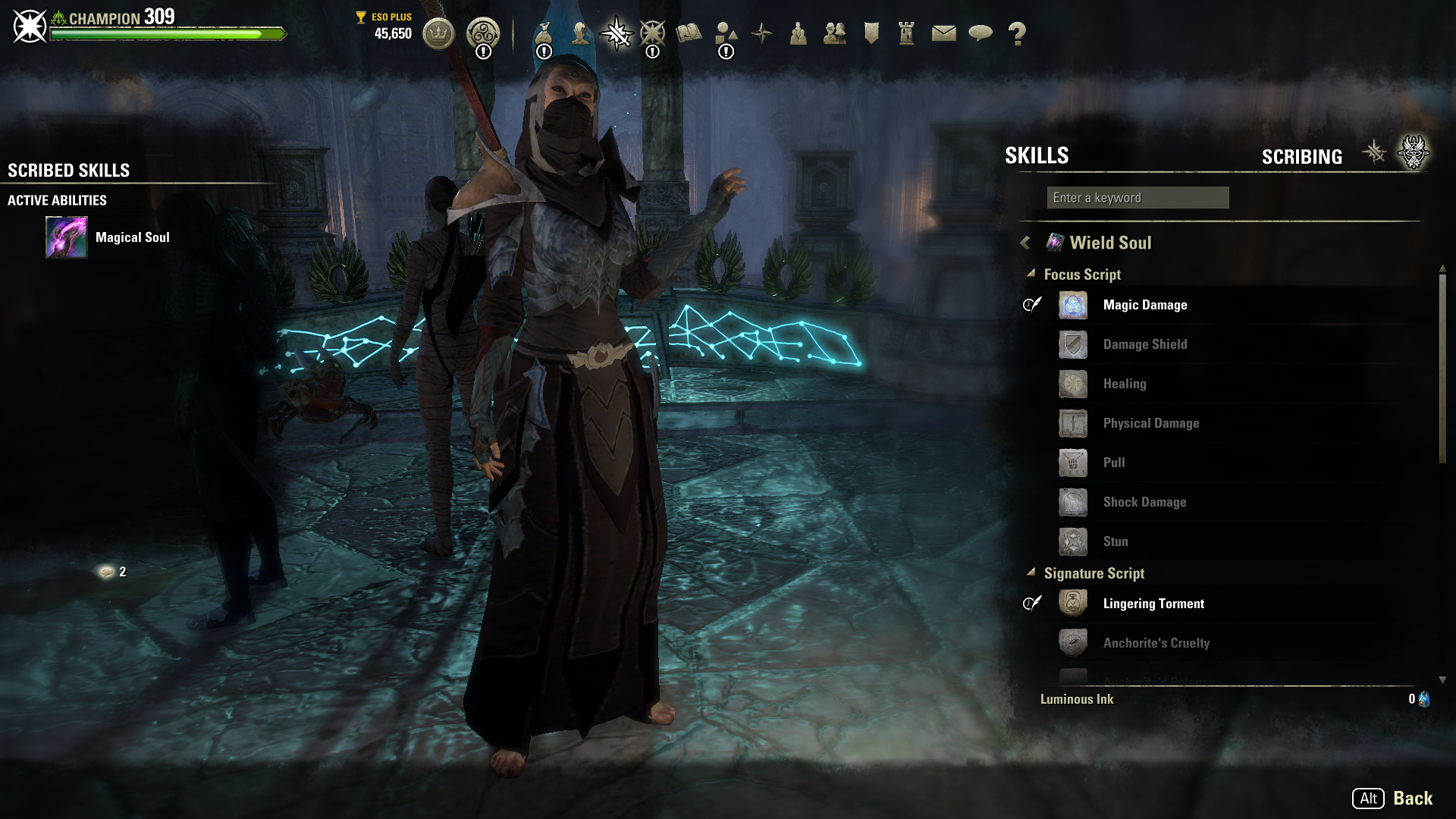
Scribing
Scribing was the “Back of the Box” feature for the most recent chapter update. For this feature, I designed the flows for crafting and equipping new skills. Additionally, I designed the “Scribary“ where players can view all the scribing content in the game.
An important component of scribing involved surfacing as much information to the player as possible during the crafting experience without overloading them. Armed with information, players have agency to chase locked content in the order desirable for their playstyle.
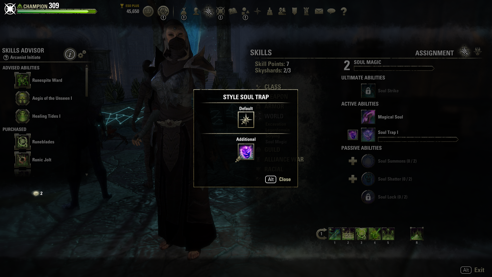
Skill Styling
Skill Styling was a small feature that allowed players to spruce up their abilities with a new color or animation. My work focused on the application of styles and the messaging of those styles to other players in game modes, such as PvP.
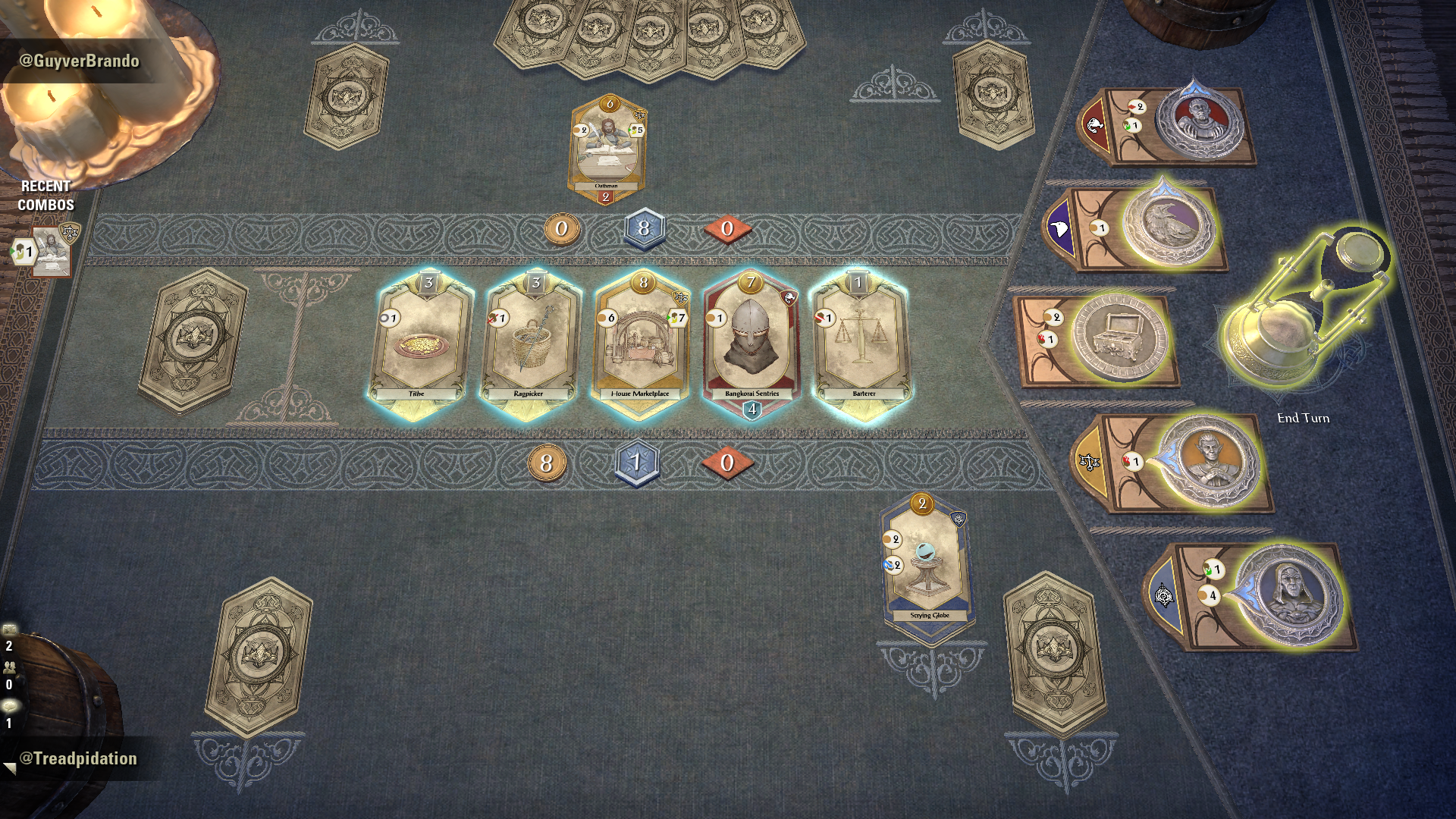
Tales of Tribute (ToT)
Tales of Tribute exists as a mini-game within the many pieces of content that is ESO. Players can queue up from anywhere in Tamriel to kill a few minutes while they wait for their next adventure.
While I contributed to many parts of the gameplay during development, I was mainly focused on:
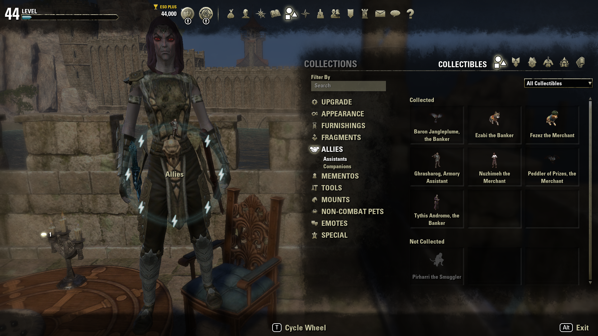
Collections menu
Pre-game deck selection
Post game match rewards
Tooltips
Card Elements

Tales of Tribute Deck Viewer (Collections Menu)
For ToT, this screen serves as a portfolio of all the decks and cards the player has unlocked.
Initially, I had intended this screen to be an actual book that the player could not only carry around, but also flip through - similar to a modern day card binder. However, after several iterations, it became clear that using our existing flow for collectibles would be more fluid. While the idea was cool, having a separate piece of UI pop onto the screen would take players out of our existing collections flows. If we implemented something so unique for this feature, the next feature requiring a similar solution would create numerous splits in our flows that are arbitrary and confusing for the player.
The footprint of the screen was a particularly important problem to tackle. It is hard to keep track of your 13+ cards when you can only see a couple at any given time. One major issue throughout this entire project was legibility of icons and text. The collections window was no exception.
Eventually, I decided to make the cards 1:1 with the size they would appear while playing ToT. Players would need to identify cards at that size regularly while playing, including new cards and mechanics they had not encountered before. I believed this was the best way for players to begin recognizing those patterns. Additionally, this format allowed for 6 cards to be on screen at the same time, or roughly a third of each deck. While this number was not ideal, it was the happy medium that allowed for greater transfer to the actual game itself, while still allowing for a broader view of the deck and its unique mechanics.

Tales of Tribute Pre-game Deck Selection
The patron selection screen was my personal favorite to work on. There were interesting problems to solve when it came to player recognition of game mechanics.
The major culprit of this was recognizing that the patron coins (shown on the the right side of the screenshots) were an integral part of gameplay. First time players typically did not interact with the patrons at all, which of course would eventually become a problem when another player beat them senseless with the patrons in a match.
To help alleviate that issue, the design I came up with had a 2D and 3D component. The UI would be used to lock in the patron deck, which would fire an animation. This animation would move the world space, 3D coin object onto the board. The objective was to link the player choice of their patron with a piece of the gameboard being set up. In turn, this would link to gameplay mechanics with that coin. It ended up looking pretty cool, and our audio designer did amazing work to make the action of locking in a patron feel impactful.
There were a couple bumps in the road while designing this flow. Players go through a snake draft to get their patrons. The first player picks the first patron, second player picks patrons two and three, and the first player picks the fourth patron. I wanted to help reinforce this style of drafting, so players would understand this flow the first couple of times they went through it. To that end, my initial design had a built in delay after each coin was drafted. It was largely a miserable experience for our internal playtesters, especially those that were more experienced. It made the UI feel sluggish - a valuable lesson learned that we luckily were able to iterate on before the feature launched.


Target Markers
The target marking system was designed to apply simple markings to entities in the world, which players could apply meaning to. The hardest challenge for this feature was the input, given how many keybinds are taken up, especially on console (gamepad). Additionally, there were discussions on the behavior of the markers while in PvE vs PvP activities with combat and system design.
Infinite Archive
Infinite archive was a new mode that required a mix of HUD and standalone screens.
As the player cleared stages, the HUD helped convey the progression through the archive. This was supplemented by announcements in the middle of the screen.
The standalone screen shown in the pictures on the left were a way for players to track their buffs throughout their progression. As this mode is in theory endless, the buff tracker needed to be able to handle a large / infinite amount of buffs, but not dominate the screen.

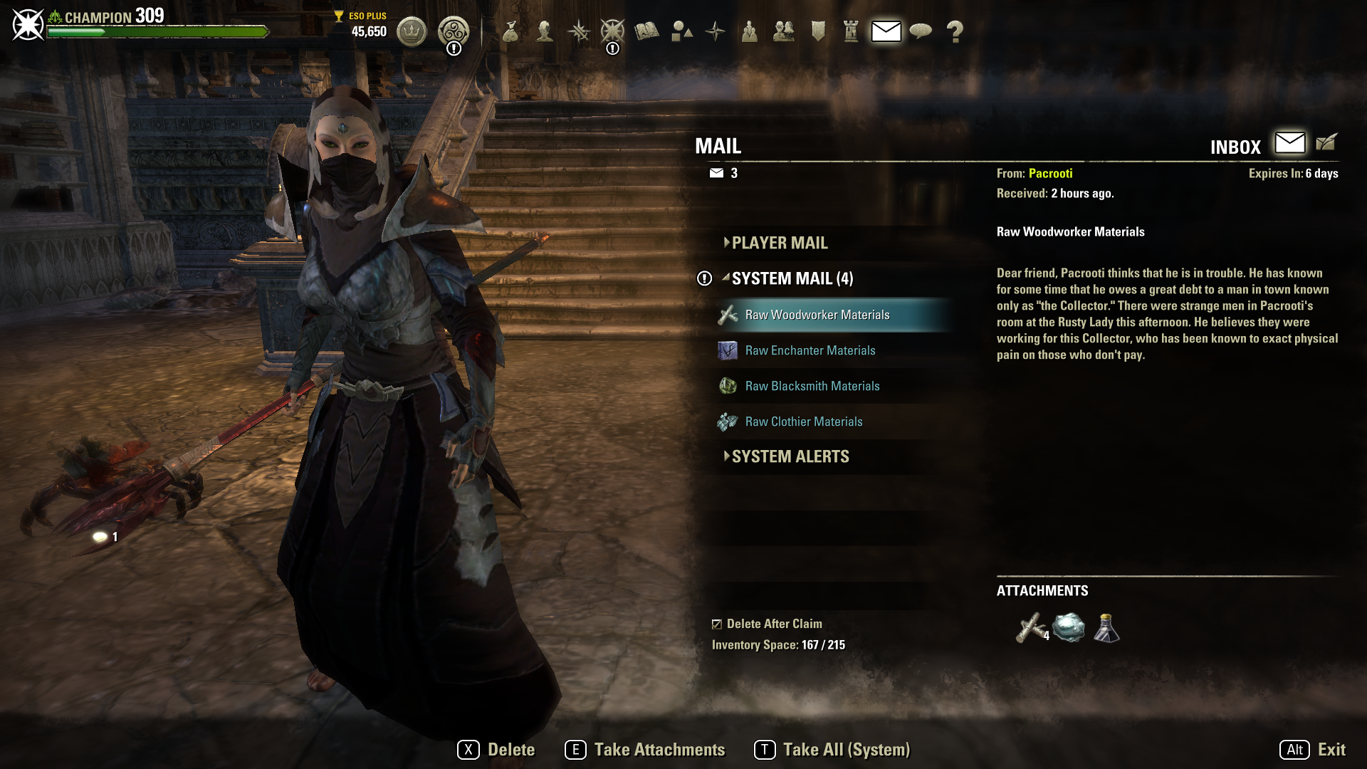
Mail Improvements
This feature was an improvement of the mail system designed to help players collect their rewards more quickly (Take All Keybind) and automatically delete the empty mails. Additionally, the mail’s first attachment was displayed as an icon next to the mail name to give the player a small preview of their goodies.
Quick Select Wheel Upgrades
With the increase of options in the quick select wheel, there was a demand to increase the number of available quickslots. This feature expanded the number of slots the player had access to. It also granted the player more flexibility for what was placed on the main / primary quick select wheel.